
Coronavirus COVID-19 Visualization
A web application to allow the general public to explore region-to-region similarity in Coronavirus cases over time, and to see estimates of when a region's case curve may 'bend' and begin to flatten
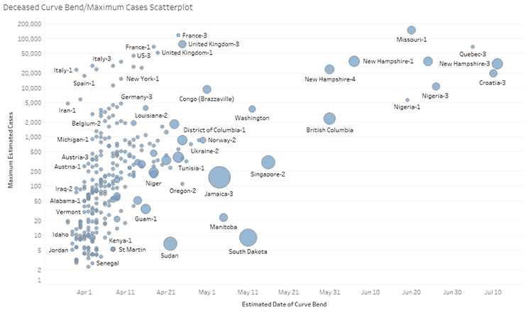
We recently published a visualization dashboard for exploring Coronavirus (COVID-19) case progression. Our dashboard allows viewers to select a target region to see how similar the region's case progressions are to all other regions reporting data. Users can also view estimates of when regions' case curves may "bend" and begin to flatten. Dynamic time warping (DTW) and four parameter logistic regression (4PL) are used to generate our estimates. Standard case progression graphs and worldwide maps of case counts are also provided for additional content.
Social Media Analysis
A web application to estimate and visualize sentiment—an attitude or thought based on emotion—for tweets from Twitter. Each tweet is shown as a circle in an emotional scatterplot, with pleasure on the horizontal axis and arousal on the vertical axis. Other methods of viewing the tweets include topic clusters, a heatmap of tweet counts by sentiment, tag clouds of frequent terms, a timeline of when tweets were posted, and a map of where tweets were posted
We have recently updated our web application for visualizing tweet sentiment. Recent tweets are requested based on user-chosen keywords. An estimate of each tweet's sentiment is made from its text. The results are visualized in numerous ways: in an emotional scatterplot with horizontal pleasure and vertical arousal axes, clustered by topic, in a heatmap that counts tweets by sentiment bins, as a tag cloud of frequent terms, as a timeline of when tweets were posted, as a map of where tweets were posted, and as a list of tweets and their associated sentiment measurements.